Thursday 13 March 2014

Sunday 5 January 2014

Evaluation question 7

Looking back at your preliminary task what do you feel you have learnt in the progression from that to your to your full product?

Doing my preliminary task was the first time I properly used photoshop therefore i struggled a bit and now feel as though I could have done a lot better on it. If i had done the task now i believe i would have done much better as i have a lot more experience and knowledge of the software. I think there are key differences between my preliminary task and my full product as my school magazine looks a lot less professional and less eye catching due too my lack of experience with deigning magazines. Also i had a lot more time planning my final product and i could research into it more meanwhile the preliminary task was very rushed and unprepared.


I feel like I have learnt a lot more about how the layout of a magazine should be presented now that i have practised designing and researching more about the design of magazines. I think that on my preliminary task, the masthead could have looked a lot more eye catching as it didn't look
 as bold and prodominant as my full product. I believe that the font would have also looked better if it was more stretched downwards so that it takes up a fuller part of the top third making the masthead stand out against the sell lines. The sell lines also look quite out of place as they arent set out in a very presentable way and look unmeaningly scattered acoss the page. I also think the main image could have looked more succesful If i had placed my model directly looking at the camera to give a more personal feel. Although, i do think my main image is well suited to a college magazine as the props used are appropriate and anchor with the sell lines.
On the contents page, there are various improvements that could have been made which i now notice after looking at so many professional magazines. For example, the page numbers in my navigation bar look way too big in size and also they aren't placed in a straight line which looks incredibly untidy.

I have learnt a lot about how important the genre of a magazine is and how it is esential to include your target audiences key interests and favourite artists to encourage them to buy the product. Colour schemes also come into this as different colours connote with various moods and genders.

Evaluation question 6

What have you learnt about technologies from the process of constructing this product?

Whilst creating my product I have used a range of different technologies and developed my skills on them through practice. In order to complete different parts of the project I have adapted and learnt how to use different programmes, softwares and devices.
The technologies I have used are Adobe Photoshop, Adobe InDesign, Blogger, Internet, digital cameras, facebook.

Photoshop- I have used Photoshop a lot throughout this project as it is a useful software for creating magazines and designing. When I first started using this I had very little knowledge on how the programme worked and what to do, although as I spent more time on Photoshop it became a lot easier. 

Internet- The internet had been helpful whilst completing the project and was used a lot whilst researching magazine ideas. This allowed me to understand and figure out my target audience and how the overall design of magazines should look.

Indesign- Indesign is used widely in the media industry therefore I used the software whilst creating my double page spread. I enjoyed using this as it's quite easy to use when creating a magazine product in order to make it look professional. Although I hadn't used this software before, I adapted quite easily to it and figured out how to use it in a short space of time.

Blogger- During the making of my product I frequently blogged about what I had achieved in my work every so often showing my progress gradually. I also used this to plan my work, noting down my research and building on my ideas. This also proved extremely helpful whilst posting my evaluation.

Facebook-  I used facebook so that I could firstly contact my model and inform her on what clothes she would be wearing. We then arranged a date and time so that the shoot could easily be planned. 

Technology has overall helped me with the full project from designing my front page, contents page and double-page spread to tracking my research and showing my progression. Without these i would have struggled with my products and the outcome of my work would have been substantially different.


Evaluation question 5

How did you attract/address your audience ?


I had also carried out a survey including questions such as 'What colours would you like to be seen in the magazine?' and 'What gender model would you like to be seen on the front cover?'. The answers to these questions were that more people wanted bright colours on the magazine and a female model on the front cover therefore I considered peoples opinions in order for it to appeal to an audience.

Evaluation question 4

Who would be the audience for your media product?


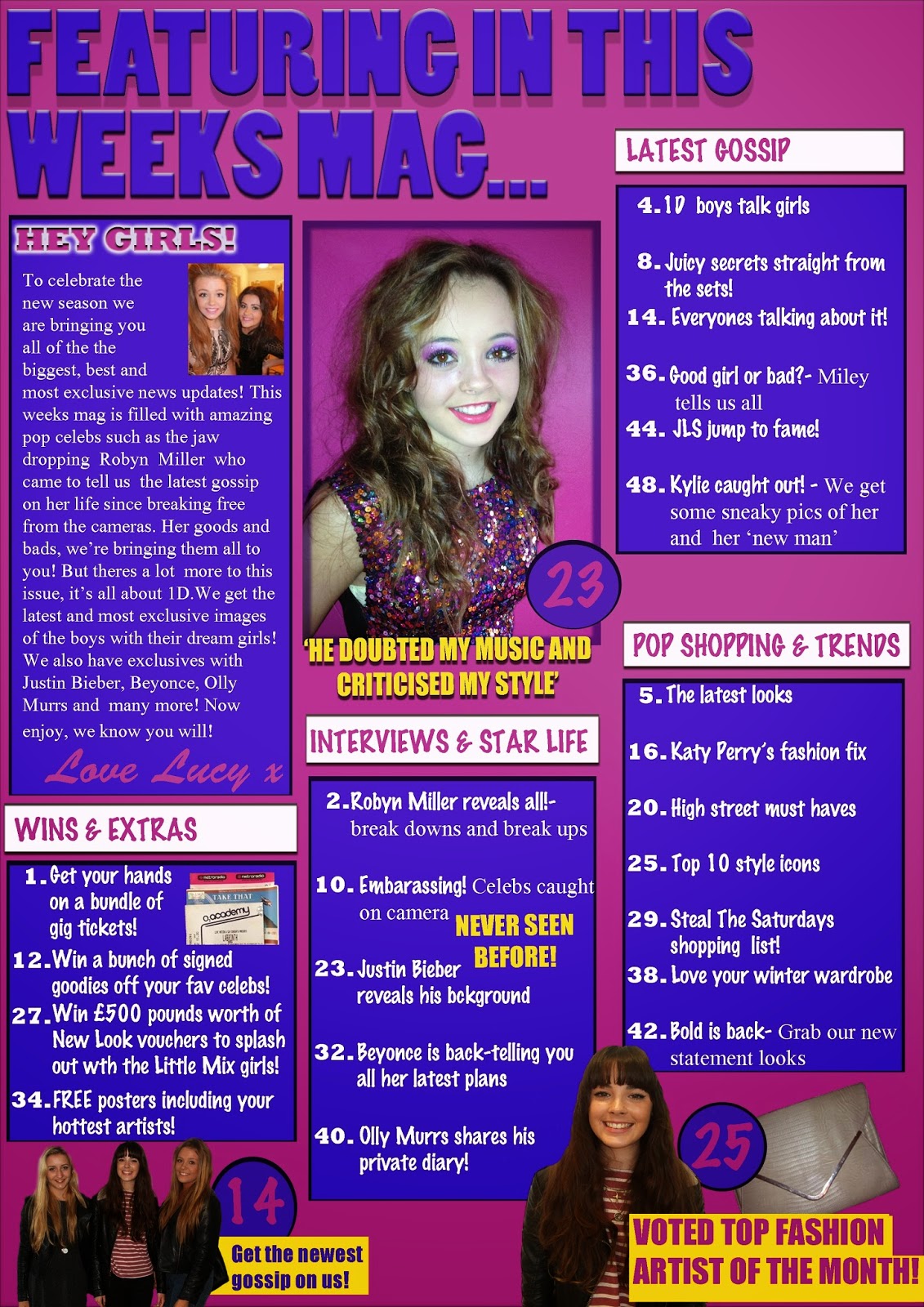
The audience for my music magazine is young girls around the age of 13-16 years old and will be interested in the genre pop music. Pop music is connoted as being bubbly and happy music which is therefore associated with young girls.

Interests- pop music, going out with friends, cinema, jewellery, makeup, fashion, school.
Like to see- Interviews, latest news on pop stars, latest fashion, exclusive news, beauty tips, offers and chances to win.

Listen to artists such as- Jessie J, One Direction, Justin Bieber, Katy Perry, Cheryl Cole, The Wanted

Ethnicity- Mostly White British

Social class- Parents who are working class

Spend money in- New Look, Primark, McDonalds, magazine shops


My magazine is brightly coloured and the fonts are also easy to read due to the fact my target audience is quite young so it isn't made to look complicated. I think that young teenagers would buy my magazine because it includes popular pop artists that they would be interested in and also the colours used looks bright and appealing.


Evaluation question 3

What kind of media institution might distribute your media product and why?

After researching various different pop genre magazines, i found that Top Of The Pops is published by BBC magazines meanwhile We Love Pop is published by Egmont. I think both companies could distribute my magazine as it's very similar to both Top Of The Pops and We Love Pop. BBC although tends to be slightly more educational and i don't think my magazine fits as well into that.


The British Broadcasting Corporation is a public service broadcasting statutory corporation. Its main responsibility is to provide impartial public service broadcasting in the United Kingdom.


Egmont is the UK's biggest children's publisher and is one of the worlds biggest media companies. Egmont sells more than 25 million books and 12 million magazines per year and is also a private company owned by a charitable foundation.
Therefore, i believe my media product would be most likely distributed by Egmont as both, We Love Pop and my magazine share features such as, articles, gossip, celebrities, fashion, interests in what is happening right now with artists and most importantly an obsession towards music! Both magazines are also aimed towards the same audience and genre therefore i think Egmont would be able to publish it well.
Overall i think that Egmont would most likely distribute my media product because they share a lot of similarities in the style of our magazines.
I think We Love Pop and Pop Charts will both attract audiences of pop genre although different stars used in each magazine will attract different people to the magazines therefore they will cover different stories and interests on artists making both magazines successful within the company.

Evaluation question 2

How does your media product present different social groups?


I believe that there are various different similarities between both Cheryl Cole used as the main image on Top Of The Pops magazine and the model i have used on my magazine. For example, they both have extremelly similar hairstyles showing off loose natural curls. The positions both models are standing in are also very similar as it doesn't look as if they have been made to pose a certain way and they look very natural and easy going.  There has also been no props used allowing all of the attention to be on the models themselves. Although both models are wearing different colours, i believe they both still fit into the audience of young teenagers interested in pop as the colour white shows innocence of the young teenagers but also the pink/purple colours also show the fun quirky side of them. The fact that both models are wearing a high neck dress is also important as they aren't wearing anything too revealing or indecent. Facial expressions shown by both models are also alike as they are both doing a super smiler shot giving the impression they are happy and inviting towards readers. Although, the makeup looks quite different on Top Of The Pops main image as it look like more natural colours have been used. Meanwhile, i have chosen bright pinks and purples as part of my models makeup as i believe it will make her stand out more and make her look more experimentive rather than plain.
I think both models would appeal to fans/readers as they look welcoming as their eyes look engaging and their facial expressions are happy and welcoming. I also think people might aspire to be like them as their makeup and fashion sense is of a typical teenager and would make them want to look like the models.